|
|
~MENU~ |
| Home |
| The Concept |
| The Boat |
| Bringing Her Home |
|
Weekly Progress Log |
|
Daysailor Projects |
| The Boat Barn |
| Resources |
| Other Sites |
| Email Tim |
|
|
| The Concept Part 2 |
|
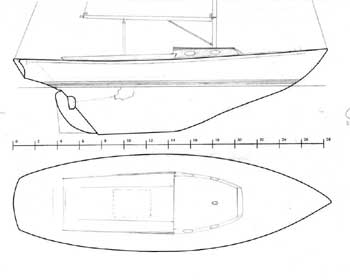
Some Various Iterations and Sketches Starting with a blank hull profile and deck drawing, I sat down to begin trying to transfer my ideas to paper. Now, I'm no artist or architect. I took some mechanical drawing and a naval architecture class many years ago in school, but that is the extent of my training. I tend to be a hands-on, figure-the-problem-out-as-I-go kind of guy. Still, I had to get this on paper to judge the look and, later, for properly figuring out the construction and layout details when I get down to brass tacks. Armed with a wooden ruler and a pencil, I laid out my first, gut idea of the look of the boat. The drawing was not precise, or even accurately to scale, but it provided a visualization for me, and others, to see. At the onset, I was envisioning something more along the lines of the Pearson Ensign, or the popular 28' Alerion sloop, which is as close to a modern version of the Triton as anything out there. What I came up with, while far from perfect, was at least attractive and had potential. I envisioned varnished wooden coamings and cabin trunk, with additional bright deck trim, but a fiberglass deck surface instead of the more expensive and labor intensive teak.
|
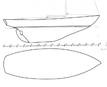
At the same time, I drew up a slight variation of the above concept, in an attempt to address my stated concerns about the cockpit being too large, and the cabin trunk too far forward. What I tried to emulate with my second sketch (it failed) was a look reminiscent of some of the long, narrow, classic designs with tiny cabin trunks, relatively short cockpits, and huge, long foredecks that just look so cool--designs like the Dark Harbor one design, or the Northeast Harbor one design come to mind. Obviously, however attractive a Triton hull is, it isn't one of these classics. Still, the concept was worth throwing around. I put even less time into this drawing, partly because I wasn't happy with how it came out in the first place. Again, I envisioned this design with a bright cabin trunk and coamings, alongside additional wooden deck trim.
|
|
Based on my own thoughts and the input from those I showed the designs to, I decided upon a change in the overall concept of the boat--something that would bring the look more into focus and along the lines of what I truly was going for. I had tossed around the idea of creating a more basic deck design, and more open, along the lines of some of the more classical designs heralding back to the turn of the century and often emulated in the meantime. This basic idea led me down the road to what is, for all intents and purposes, the final conceptual design. |
 Concept Critique:
While this was a valiant first attempt, it failed to capture the
feeling and essence for which I was shooting. The overall look
is a bit too similar to the Pearson Ensign (22') and Commander (26'),
and I hoped to better distance my design to enhance its custom
construction and unique nature. The cabin trunk is too far
forward, even though the foredeck is longer than the original Triton
design. The roomy and secure cockpit is surely a plus, but,
despite any advantages, this design just didn't quite fly with me, or
with my in-house critics. Obviously, this is a rough sketch
only, and there are many smaller problems that would require
additional finessing and modification if the design were to be built.
 Concept
Critique: If I hadn't, with the help of friends' input,
been able to come up with my third, and more or less final, concept
(see it below), I probably would have attempted to draw a more
successful version of this one. I still think the basic idea has
some merit, but the execution of this drawing is poor, and does not
stir the soul. For this to work, the cabin trunk, which is
located completely aft of the mast, would need to be lower and
probably shorter. The wide expanse of foredeck
extending aft past the mast partners would have been interesting in a
more accurate drawing.