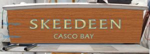
Skeedeen Transom and Lettering Thoughts: Updated 10/6/20
My general thoughts on the lettering:
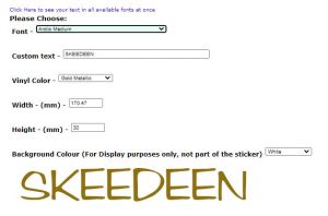
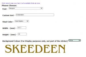
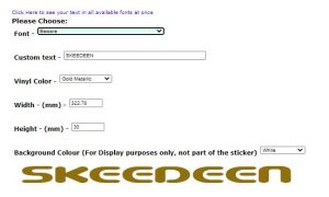
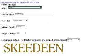
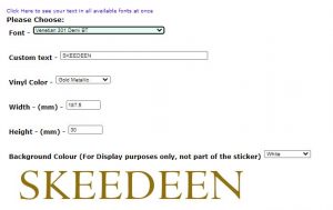
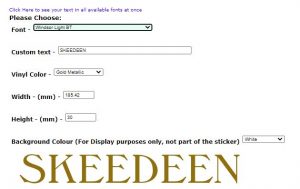
There are a lot of Es in the name, and this is a dominant letter because it is square and large and wide, so the E is important here. I find a lot of the fonts with serifs to be too busy with all the Es and their various flourishes (including the vinyl we put on some years ago, in retrospect), and generally speaking my eye has gone to fonts with stylish, but less bold, E shapes.
The leading S is also an important letter and needs to be of proportion similar to the wider letters that make up the name (K, N, D, and E). I have always felt the S in the current graphics was weak and looked diminutive beside the other letters.
The new name should take this all into account, and I have tried to suggest fonts that help with these issues.
———-
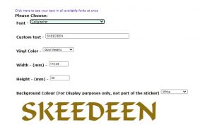
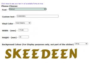
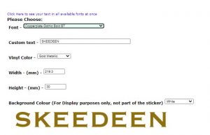
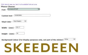
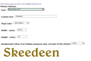
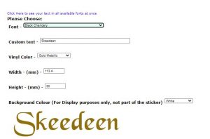
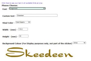
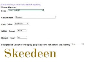
To see the boat’s name displayed in many different fonts all at once, I find it helpful to use this site that I discovered long ago. This makes it easy to see what catches your eye.
Let’s start with all capitals:
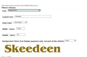
Now let’s look at some options using upper and lower case letters:
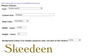
Earlier, Renee came up with a few choices. I have narrowed her choices down to this one because I think it works quite well with the name (outline color notwithstanding; more on this in a moment):
I like this one because all the letters are roughly the same width, the leading S is large enough not to be lost, and the dominate Es are much less overbearing with their contoured legs and the lack of serifs on the center line.
Specific thoughts about painting the name
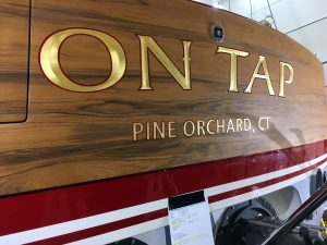
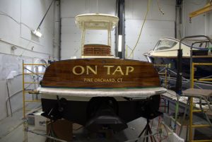
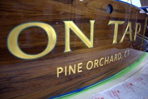
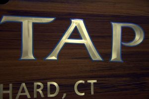
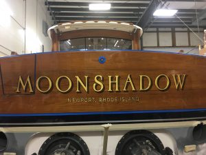
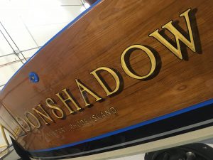
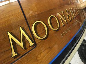
I like, and you also like, the convex burnished gold leaf lettering that Renee does. These are two different boats with the same name, but both show the detail of the convex letters. I think this is a great look.
Another thing to consider is the transparent shadow effect, which I also really like. Note that this is also the burnished convex gold leaf. This font itself isn’t bad either (looking mainly at the D and N since they’re in your name), though I think the S is a little wimpy to be a leading letter; but maybe there’s a way to deal with that. But overall this font is interesting and mostly traditional, without being staid. I’d like to see what the Es are like.
I also dare you not to be humming Cat Stevens all damn day long now.
In terms of the paint styles, I lean strongly in favor of the convex burnished gold leaf, with either a black or red outline. Both outline colors are traditional, and the red works even if the boat isn’t red. Of course the final font chosen might have an impact on the style of gold leaf, and all that is very much still under discussion and consideration. I could be convinced to go with the hull color outline if Renee thought it was the best look, but I like the darker colors myself.
Teak Transom Specifics
I think Renee’s ideas are important here, but I lean towards having individual “planks”, and to taking the faux teak right down to the boottop (i.e. below the swim platform), since it’s only a few inches anyway. I am not yet sure on whether or not there should be bungs: I like examples that I’ve seen both ways. Most of her stuff seems to have the hull color at the edges of the transom, and while I would defer to Renee’s suggestions on this, I am leaning that way now.
